Appearance
Theme components
Garnet provides theme components for the marketplace. All components can be recreated using liquid code, or any other frontend framework. They can be drag-and-drop directly in your Shopify theme.
Vendor login
By default Garnet will generate a login and application page. You can also use our component to let the vendor sign in from anywhere else in your store.

New vendor login (beta)
The [beta] New Vendor Login component is a lightweight, self-contained sign-in form you can drop anywhere in your store. It comes with a clean default design, so it looks good out of the box, and every part can be customized to match your theme.
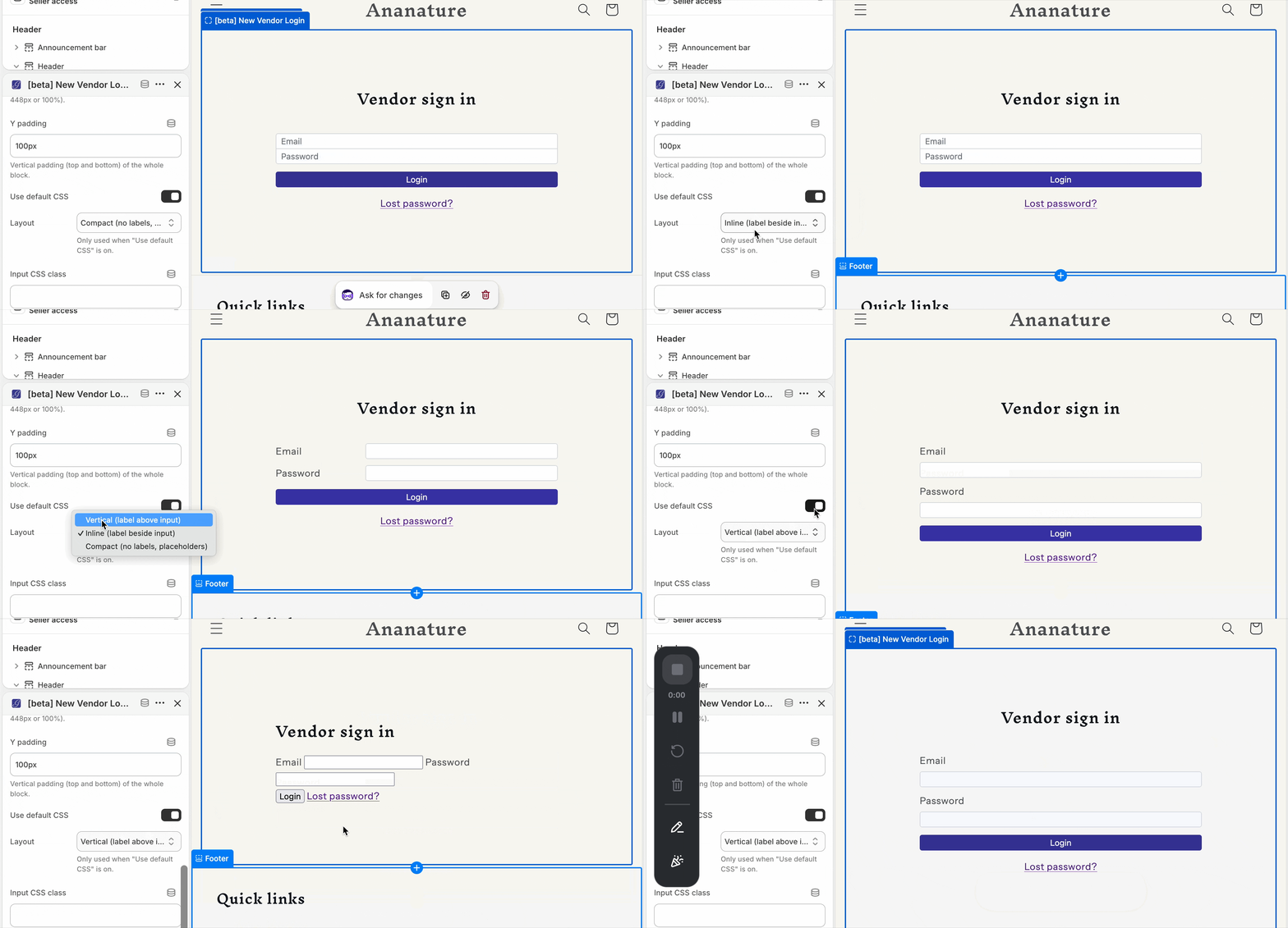
When Use default CSS is on, three built-in layouts are available:
- Compact (default): no labels — placeholder-only inputs joined into a single group, matching Garnet's default login page.
- Vertical: each label sits above its input.
- Inline: each label sits beside its input.
Prefer full control? Turn Use default CSS off and provide your own CSS instead.
Beyond the layout, you can customize the title (text, CSS class, or hide it), the button (label, loading label, color, class), the inputs and labels (CSS classes), the "lost password" link, the error message (color — Garnet red by default — and class), and the container width. When a vendor signs in, their dashboard opens in a new tab.
Vendor application
Same as the vendor login, Garnet generates a page by default and you can use this component to build the vendor application page you want.
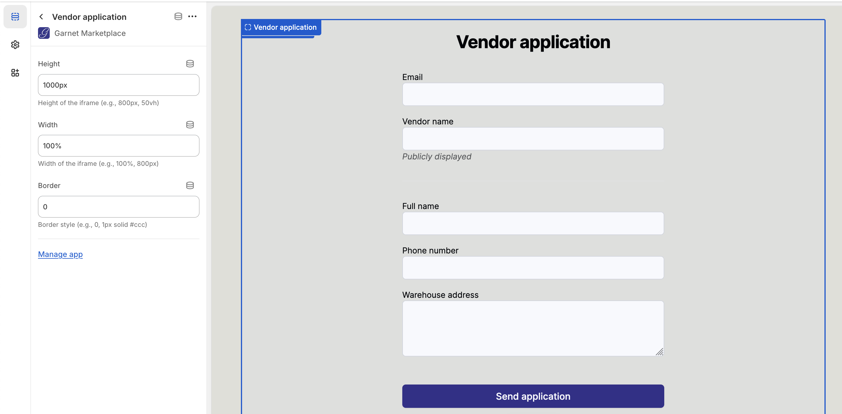
Learn more about vendor application
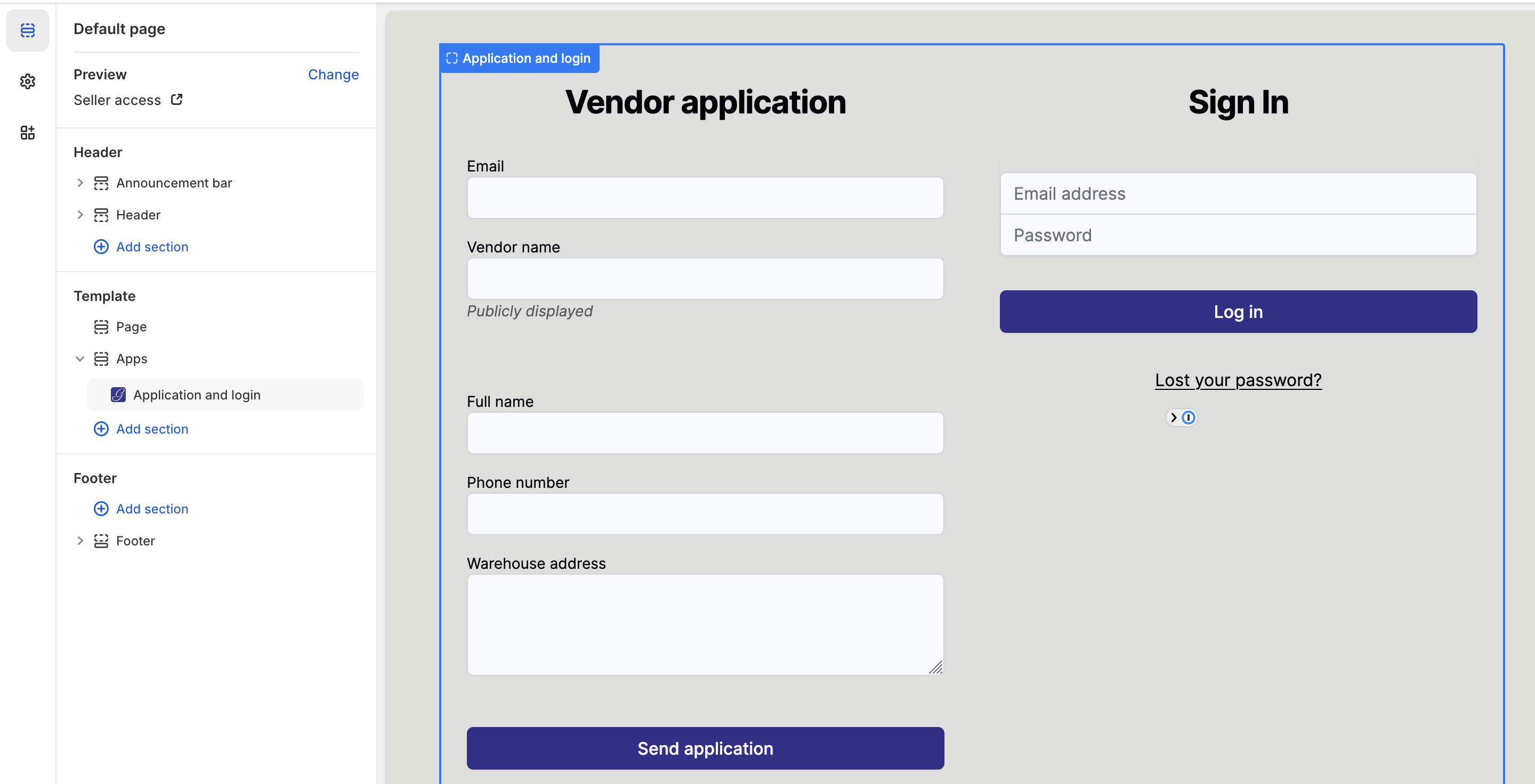
Vendor application & login
Garnet provides one component for both application and login. It is responsive and is perfect to kick-start your marketplace with a single page for vendors to both apply and login.
Vendor directory component
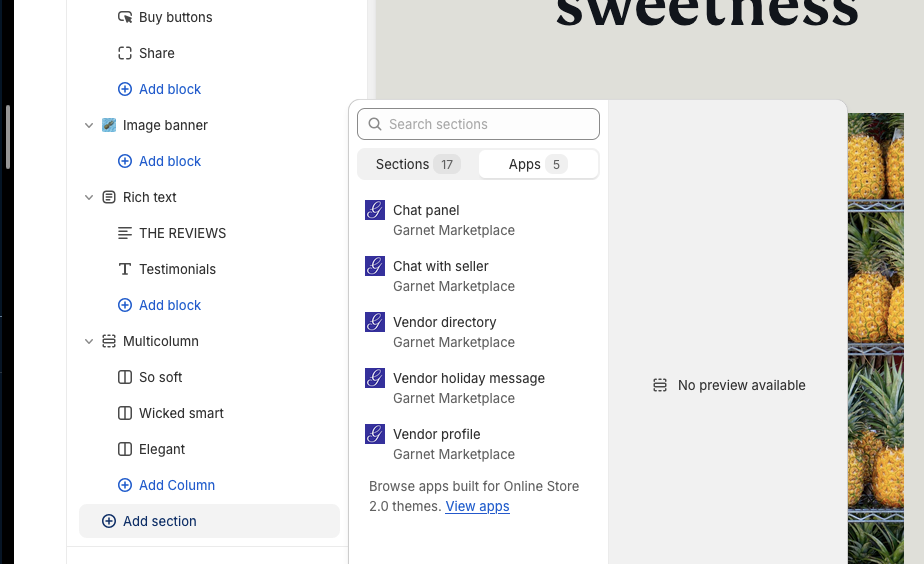
Add the vendor directory where you need to use Garnet's built-in components. Open your Shopify theme editor, navigate to the page you want to change, add a section and select Vendor directory.
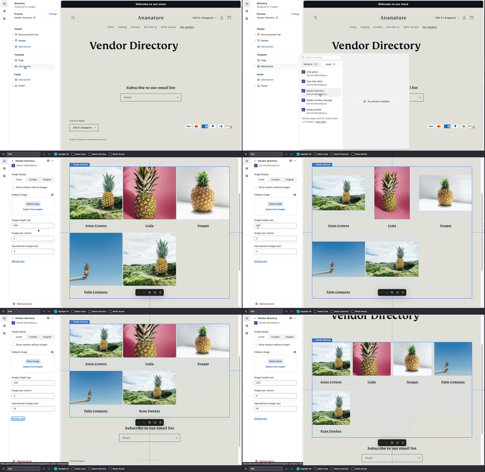
You can customize the component with the following settings:
- Use metaobjects instead of collections: Read vendors from the Garnet Vendors metaobjects instead of vendor collections. If you started to use Garnet after May 2026, it is the best solution.
- Metaobject image field: When using metaobjects, the field key of the vendor image on the metaobject (default
collection_image). - Image source: Choose between "Collection image" (default) or "Collection metafield" to use a custom metafield as the vendor image.
- Metafield key: When using "Collection metafield" as image source, enter the metafield key from the vendor registration form (e.g.
profile-picture). - Image display: How images should fit the tile.
- Show vendors without images: hide/show vendors that did not provide any images.
- Fallback image: In case you are displaying missing images, select a fallback image.
- Images height (px): The height of the image tile. The width will be automatically computed.
- Images per column: Number of columns to show.
- Gap between images (px): the space between columns.
Vendor holiday component
Displays the vendor holiday message. The message will only show if the vendor is on holiday during this specific day.
The message is automatically hidden when the holiday is over. It can be displayed anywhere in your store. Usually it is right below the purchase buttons.
Follow this link to learn more about the holiday feature.
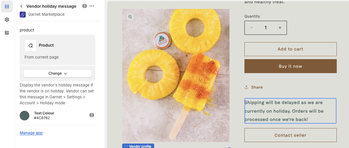
You can customize the component with the following settings:
- Product: The vendor's product to use as a reference to find the vendor's holiday settings
- Text color: The color of the vendor's holiday message. Default: Red.
Vendor profile component
Display the vendor's image and description next to the product information.
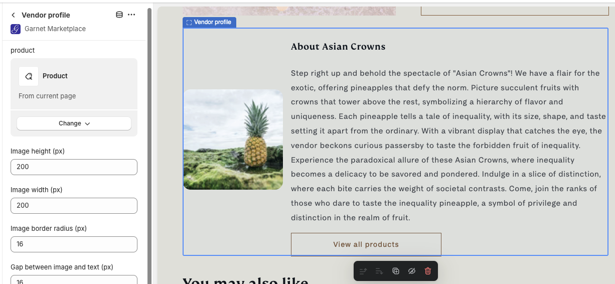
You can customize the component with the following settings:
- Product: The product to extract the vendor from,
- Image height (px): The height of the image,
- Image width (px): The width of the image,
- Image rounded corner (px): Add rounding to the image corner (0px for no rounding),
- Gap between image and text (px): Distance between the image and the text,
- Display as column: Check to display the image above the text,
- Button text: If the vendor has a vendor page, you can specify the call-to-action text,
- Button classes: Add classes to the call-to-action to match your theme's design.
Vendor links component
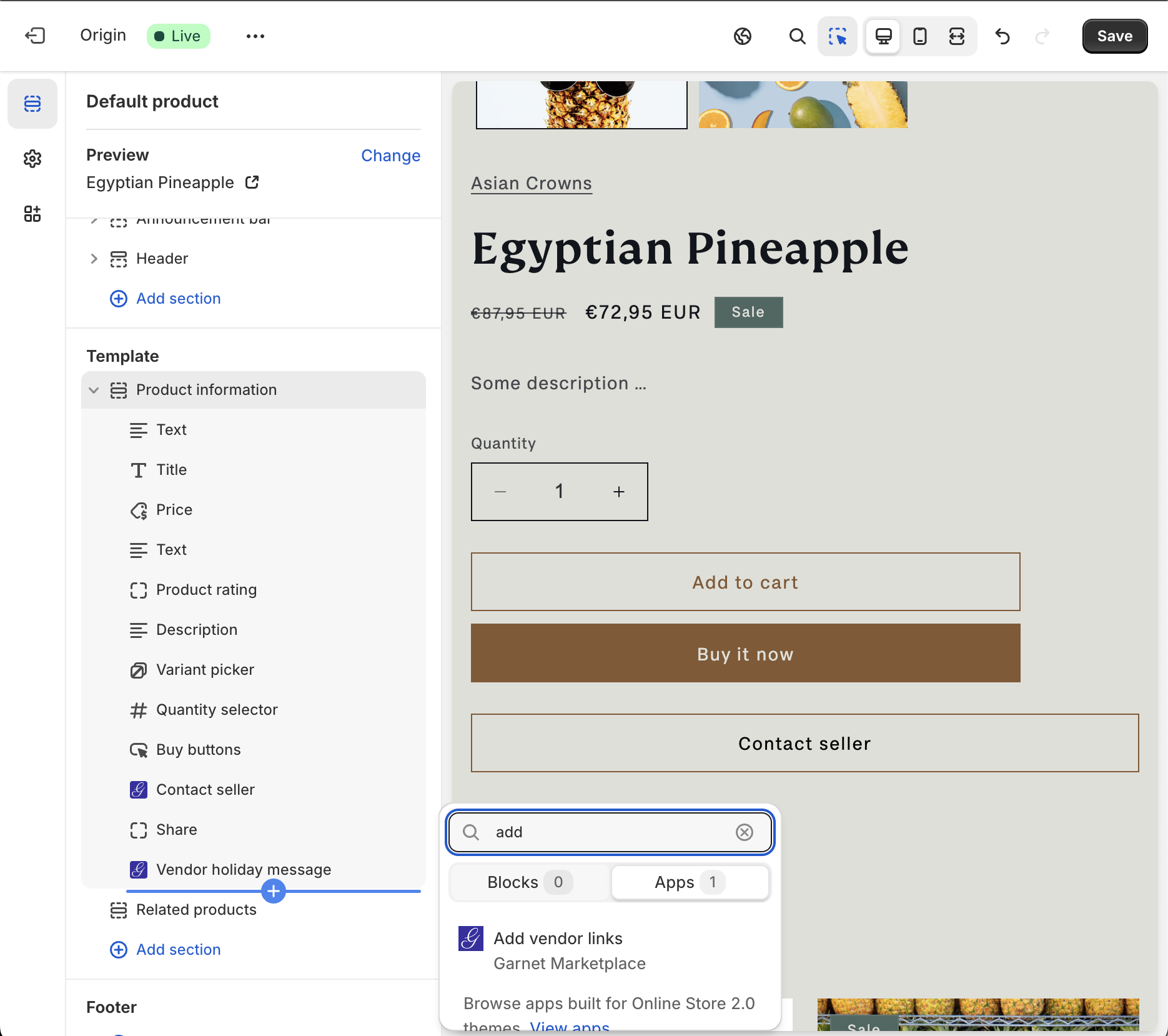
See the populate vendor page for more information.
Classic messaging component
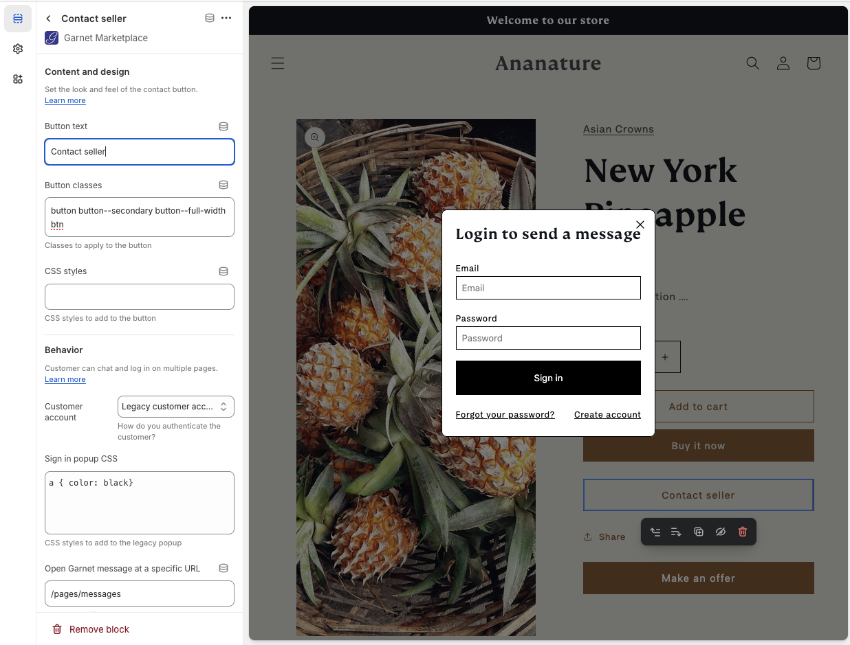
The message button component powers classic messaging: a Contact seller button that opens a dedicated messages page. See the classic messaging setup for more information. The template allows the marketplace to edit the CSS and classes of the component.
Modern messaging widget
The Messages Widget powers modern messaging: a floating, Messenger-style chat dock that appears on every page of your store, opening conversations in place with no page reload. It is enabled as an app embed rather than dragged onto a page. See the modern messaging setup for how to enable and customize it.
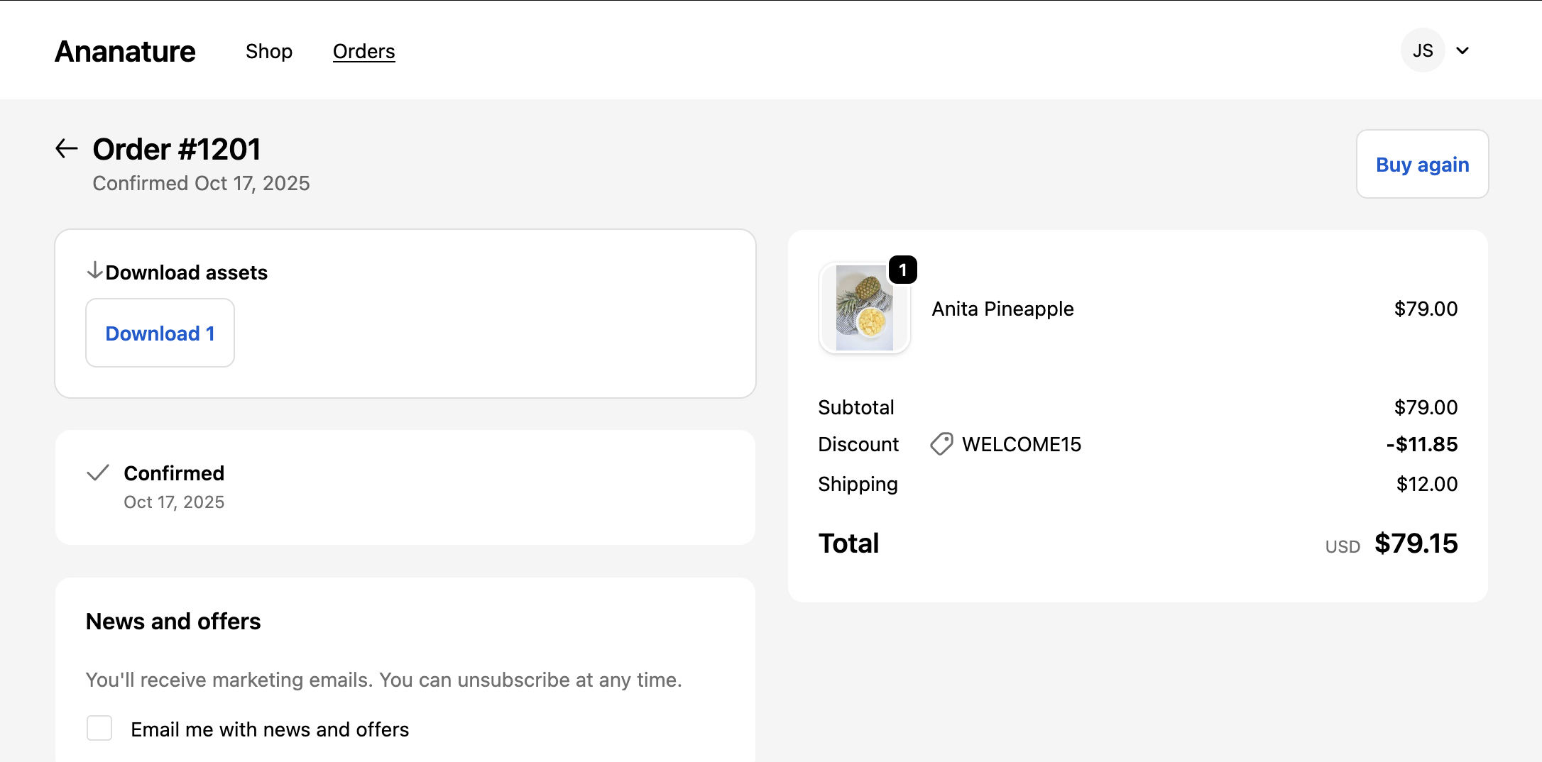
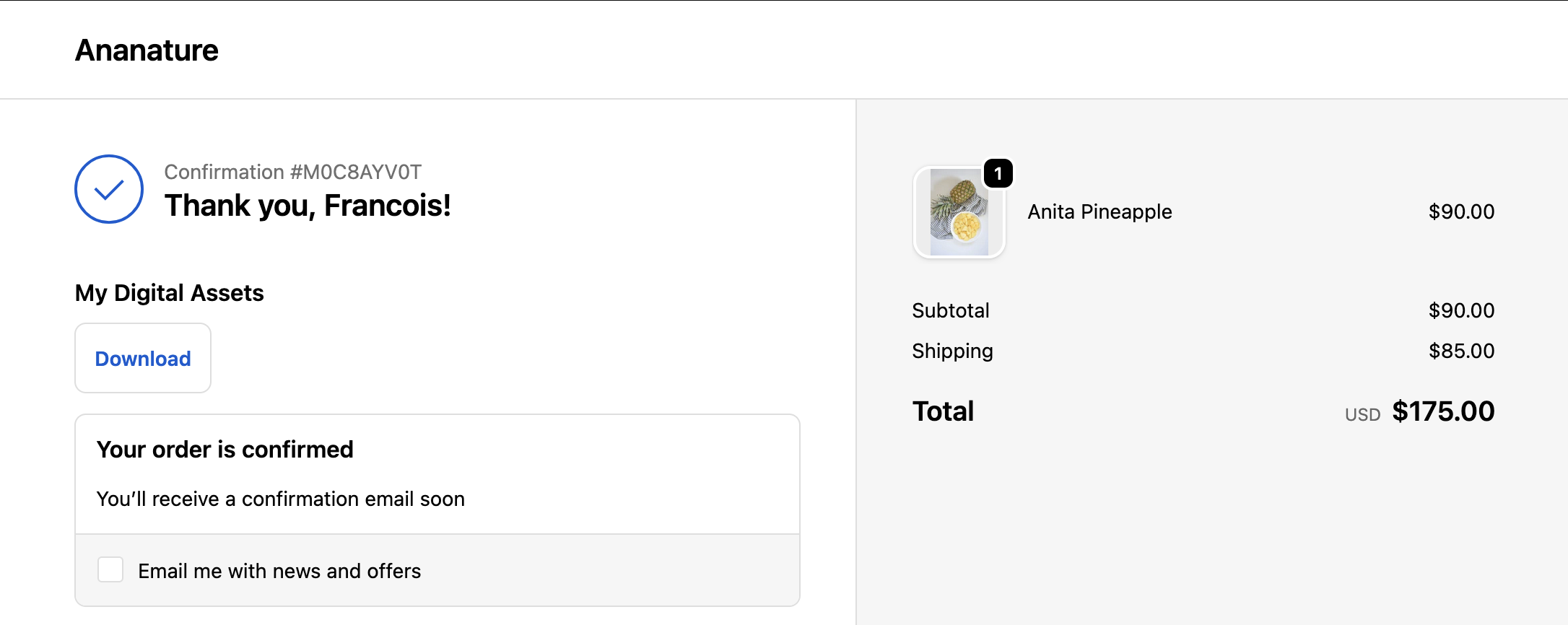
Digital assets download
Display download links for digital assets on the order status page and the thank you page. Each product with a file specification will show a download button.